If you’re here, I am going to assume that 1) You are not a graphic designer and 2) You’re probably using Canva.
There’s nothing wrong with using Canva to do your logo. There I said it! Sorry fellow designers. However, there’s a catch. Duh. Hello, I was a graphic designer myself. (And still do design things, but enough about me for a bit!)
You still need to at least consult a designer for guidance.
Even if your budget doesn’t allow for a full-on design, getting a second pair of “professional” eyes may help. You see, we designers have years of experience and an eye for detail. We went to school for YEARS to get these fancy eyes of ours. If you hire a designer to guide you with the logo creation, you have a better chance at a solid logo. We can offer guidance on font styles, design elements, and positioning. All of this is crucial to a solid logo.
If you do this, be open minded and flexible. Accept criticism. We know what we’re doing and we know what works. Trust us. If you cannot do that then you will get what you get.
That being said, here are quick tips to get you started with a shiny new logo.
- First and foremost, keep your logo simple. Yes, I know it’s hard, especially as a multi-passionate entrepreneur. But when you grow as a business, you will need your logo to be sharp and look lovely in all sizes. Something complex will have a bigger chance of distorting.
- Keep full-on illustrations out of your logo. Silhouettes are fine. 2-3 colors max. This is not the space for cute cartoons or action figures. Keep it for your image backgrounds.
- When using Canva, try to stick to a template and avoid changing it drastically. It’s your best bet for a professional-looking logo. Most logo templates are already ready for use.
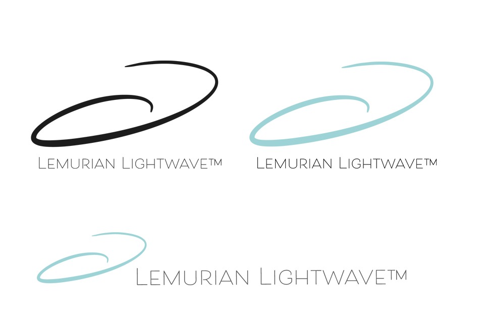
- Do not overcrowd your logo. Please. You don’t want more than 3 elements on it. It should be one symbol, your business name, and a small title at most. It should have 2-3 variations where it’s easy to crop into a symbol-only logo or have a greyscale/black-and-white version, and even a horizontal versus vertical layout. Examples:
- Make sure your file has a transparent background. No white or colored background, your branding material will be a nightmare otherwise. 😅
- Your image pixel size should be at least 3000px and higher. Yes, I know that is Chinese, but that goes under “consult a professional for help”. The reason for this size is because you want it to be suitable for all social media platforms. Please don’t worry about it being “too big”, “too big is a good problem to have, as social media sites will shrink files for you, too small can’t be fixed.
- Make sure your file resolution is 150 dpi or larger. Again, bigger is not a problem, but if it’s too small it is not fixable!
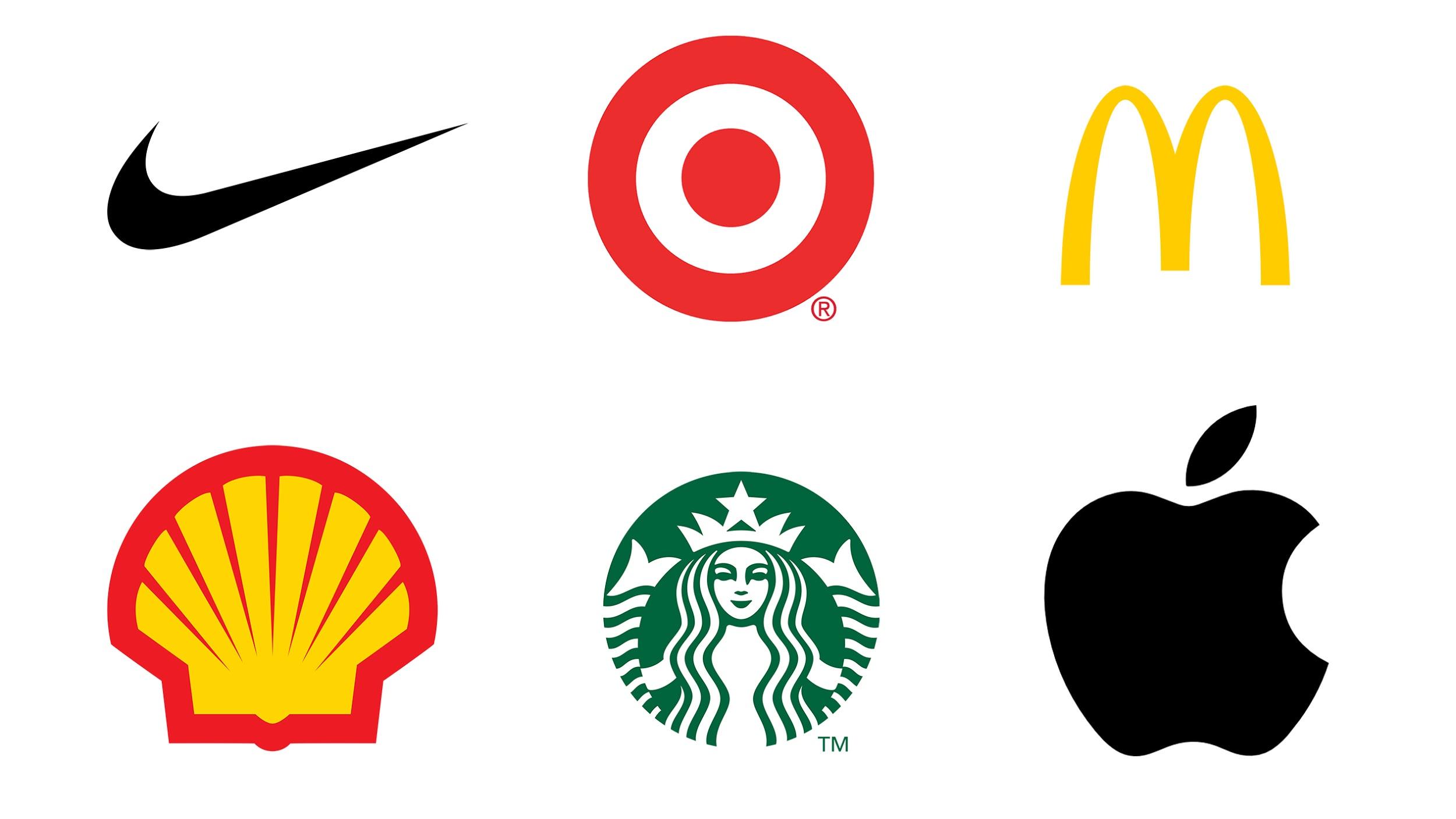
- See below for good logo examples.
Notice how most of these logos are recognizable without words. Their symbol represents the words flawlessly, they use minimal color, they’re simple, and can be reproduced easily on different surfaces. This is the ultimate #logogoals, people.
Do let me know if these tips were helpful, and don’t hesitate to reach out for a quote on consultation, or if you wish to go the extra mile, book a 1-1 session and channeled logo experience now.


